Where Conversions Quietly Die: The Three Layers of User Friction
In an economy where trust is built on system agility rather than physical presence, friction is the fastest way to lose a conversion. This essay breaks user friction down into three operational layers — interaction, cognitive, and emotional — and offers a structured way to audit each one inside any digital funnel.
7 min read
— abstract —
In an economy where trust is built on system agility rather than physical presence, friction is the fastest way to lose a conversion. This essay breaks user friction down into three operational layers — interaction, cognitive, and emotional — and offers a structured way to audit each one inside any digital funnel.
— full text —
User friction is any obstacle — a confusing interface, a slow-loading page, an overly complex process — that prevents a user from seamlessly accomplishing their goal. In a modern digital economy where institutional trust is increasingly built on system agility and reduced cognitive load rather than physical presence, friction is the fastest, most invisible way to lose a conversion.
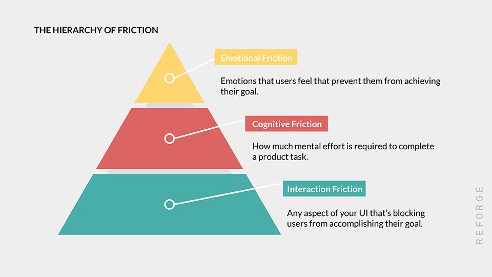
To audit a digital experience seriously, it helps to stop treating "friction" as a single thing. There are three operational layers, each with its own diagnostic questions and its own corrective moves.1
1. Interaction friction
This is the interface-level barrier. It happens when the physical design of the site or app actively gets in the way of the user taking their next step.
The mistake. Forcing mandatory account creation before a simple transaction. Splitting a single action across multi-page forms when one page would do. Designing touch targets that sit too close together on mobile. Asking for data you do not need yet.
How to optimise.
- Enable guest checkout. Always offer a low-commitment path to the final goal. Account creation can come after the user has experienced value.
- Inline validation. Catch form errors in real time as users type — "Password must contain a number" — rather than punishing them with a full page reload after submit.
- Audit your fields. Ruthlessly cut down form fields. Only ask for what you strictly need to complete the immediate action. Everything else is friction disguised as "data we might want one day."
2. Cognitive friction
This is the mental tax of navigating your digital environment. If a user has to stop and actively decode what a button does, or figure out the difference between three pricing tiers that all say "Pro," you are taxing their working memory. Working memory is a finite resource — and once it runs out, users leave.
The mistake. Internal company jargon used as if it were universal terminology. Inconsistent navigation architectures between sections. Overwhelming the user with too many equal choices at once, violating Hick's Law.
How to optimise.
- Progressive disclosure. Reveal complex information only as the user asks for it. Landing pages should focus on the primary value proposition; deeper technical specs belong behind a toggle or a secondary click.
- Leverage familiarity. A magnifying glass means search. A hamburger menu contains navigation. Do not reinvent standard UI patterns just to look distinctive — every reinvented pattern adds cognitive load with no compensating value.
- Clear visual hierarchy. Use size, white space, and contrast to guide the eye toward the primary call to action. The user should never have to hunt for what you want them to do next.2
3. Emotional friction
This is the deepest, most underestimated layer. It happens when the user experiences negative emotions — frustration, anxiety, mistrust — that cause them to abandon the journey before any rational calculation kicks in.
The mistake. Aggressive pop-ups that interrupt the user the instant the page loads. Error messages that implicitly blame the user ("Invalid input"). A complete absence of E-E-A-T signals — Experience, Expertise, Authoritativeness, Trustworthiness — on the exact pages where money or personal data changes hands.
How to optimise.
- Design for forgiveness. Make error messages helpful, human, and actionable. Instead of "Error: field required," try "Please add your email so we can send your receipt."
- Front-load trust signals. Security badges, transparent pricing, clear return policies, authentic reviews — all of these belong before the user reaches the point of friction, not after they have already hesitated.
- Respect the flow. Avoid dark patterns — tricking users into subscribing, hiding the unsubscribe link, pre-checking opt-in boxes. A transparent, frictionless exit builds more long-term brand equity than a forced opt-in ever will.
The strategic point
These three layers are not equal in cost. Interaction friction is the cheapest to fix and the easiest to spot. Cognitive friction requires real design discipline. Emotional friction is almost invisible in analytics — you usually see it as a flat conversion rate that resists every A/B test, because the problem is upstream of the test itself.3
The institutions that win the digital decade are not the ones with the loudest brand or the largest content engine. They are the ones who systematically remove friction from every funnel until their digital architecture gets out of the user's way — and the product, the service, or the institution itself is what the user finally meets.
Footnotes
-
The framework breaking user friction into Interaction, Cognitive, and Emotional layers was originally popularised by Sachin Rekhi (former Head of Product at LinkedIn). See: Sachin Rekhi, "How You Can Overcome These 3 Types of User Friction," Reforge. ↩
-
For actionable steps on progressive disclosure and leveraging familiarity — including the useful concept of "good friction," where intentionally slowing the user down can improve the experience — see: Chameleon, "User Friction in Product Design: Replacing Bad Friction with Good Friction". ↩
-
For diagnostic metrics that surface emotional and cognitive friction in analytics — including "rage clicks" and drop-off mapping — see: Whatfix, "How to Identify & Fix User Friction (+Causes, Types)". ↩
Author
Youssef Sadaki
Syrian-Canadian strategic digital transformation consultant and Middle East analyst, based between London, Ontario and Damascus. Published by the Atlantic Council, The Washington Institute for Near East Policy, The Century Foundation, Jadaliyya, and Arabic-language outlets including 7al.net.